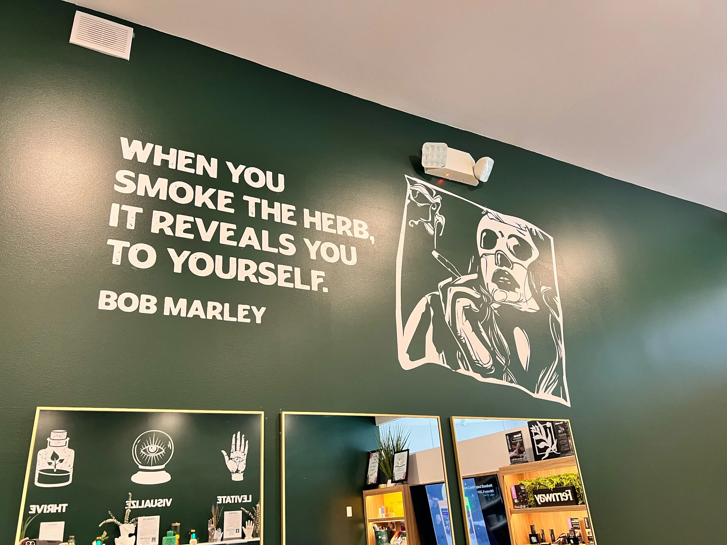
Herbwell Cannabis
Naming & Full Brand Universe — Cambridge, MA, Bronx & Manhattan, NYC
Herbwell Cannabis is a multi-location cannabis dispensary brand serving Massachusetts and New York. I developed the brand from the ground up, beginning with its name and extending into a complete visual identity, brand strategy, and retail experience inspired by the concept of a modern apothecary.
My creative direction brought together naming, logo design, typography, color, brand voice, packaging direction, photography, and environmental branding to create a cohesive, wellness-driven identity. Designed to feel modern, approachable, and trustworthy, the brand system provides a consistent foundation across physical retail environments, marketing, and third-party digital platforms.
Since its launch, Herbwell has expanded to three locations across Cambridge, Massachusetts, and New York City's Bronx and Manhattan neighborhoods, demonstrating how a flexible brand identity can support growth across multiple markets.
The Challenge
Herbwell Cannabis needed a complete identity—from the name to the visual system to the customer experience. The goal was to create a brand that felt clean, modern, trustworthy, and wellness-driven, standing apart from stereotypical cannabis branding while supporting multi-location growth.
My Role:
I named Herbwell Cannabis and built its entire brand universe, guided by the concept of a modern apothecary—a place rooted in clarity, care, calm, and contemporary design. My work included:
Brand naming + foundational narrative
Logo and identity system
Color palette, typography, iconography, and visual grammar
Voice + tone development
Packaging direction
Exterior + interior brand cues
Photography and lifestyle art direction
Full brand guidelines + implementation framework

Modern Apothecary Concept:
The identity was crafted to feel refined, minimal, and wellness-driven—an elevated space where clarity meets calm. Every element supports the idea of an apothecary reimagined for modern cannabis retail: clean lines, soft neutrals, structured typography, and a tone that feels confident, human, and warm.
The Approach:
Herbwell Cannabis was designed as a complete world, not a single identity exercise. From tone to interior cues to packaging direction, the brand behaves like a modern apothecary—clean, grounded, and designed to make customers feel at ease.
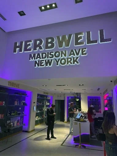
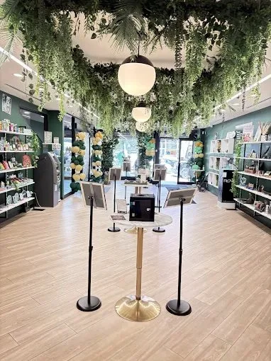
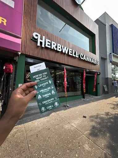
Outcomes:
A distinctive, contemporary retail identity in a crowded market
A scalable system supporting multiple locations across MA and NY
A cohesive brand world across packaging, physical retail, and third-party digital platforms
A welcoming, wellness-driven customer experience grounded in clarity and care


Implementation Note:
Herbwell uses third-party providers for web, menu, and kiosk systems.
I did not design their website or kiosks.
Instead, I created the brand system and guidelines that external teams used to apply Herbwell’s identity across:
Dutchie-powered retail menus
Online ordering templates
In-store digital displays
Vendor-driven touchpoints
This ensured the Herbwell brand appeared cohesive and elevated, even within rigid third-party digital frameworks.