
Earthwise Extracts
Solventless Cannabis Extract Brand
Earthwise Extracts was created by longtime friend and collaborator Dan Gillan, a photographer whose life took a dramatic turn after a serious motorcycle accident. During recovery, Dan traveled cross-country, learning solventless extraction techniques in California and using cannabis, yoga, and movement to transition off pain medications and rebuild his health. Earthwise reflects that journey — a brand rooted in purity, natural healing, and craftsmanship. Dan reached out to me to help shape the visual foundation for his new venture.

My Role
Logo + Brand Identity
Creative Direction
Design Consultation
The Challenge
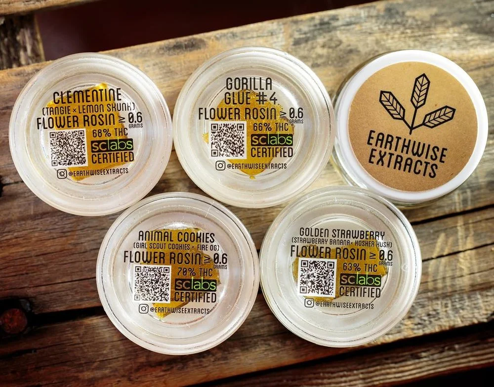
Earthwise needed a brand that honored Dan’s personal transformation while fitting within the elevated world of solventless cannabis — clean, handcrafted, and intentional. The visuals had to communicate trust, purity, and earth-driven wellness without feeling cliché.
The Solution
I developed a logo and identity system grounded in:
organic, earth-inspired forms
modern minimal typography
a grounded color palette
subtle symbolism representing growth + healing
The brand direction provides Dan with a cohesive visual language for jars, labels, strain IDs, and future product expansion.
Impact
Earthwise launched with a strong, authentic identity that sets it apart in the solventless market. The branding reflects Dan’s story of resilience and craft, giving him a visual platform that feels personal, premium, and built for growth.