
Cape Cod Grow Lab
Recalibrating a Brand Rooted in Local Craft & Culture
Cape Cod Grow Lab needed a brand refresh that preserved its local identity while creating a stronger, more cohesive visual presence. With an existing logo but no established color strategy, consistent applications, or comprehensive brand guidelines, the company needed a foundation that could grow alongside its business.
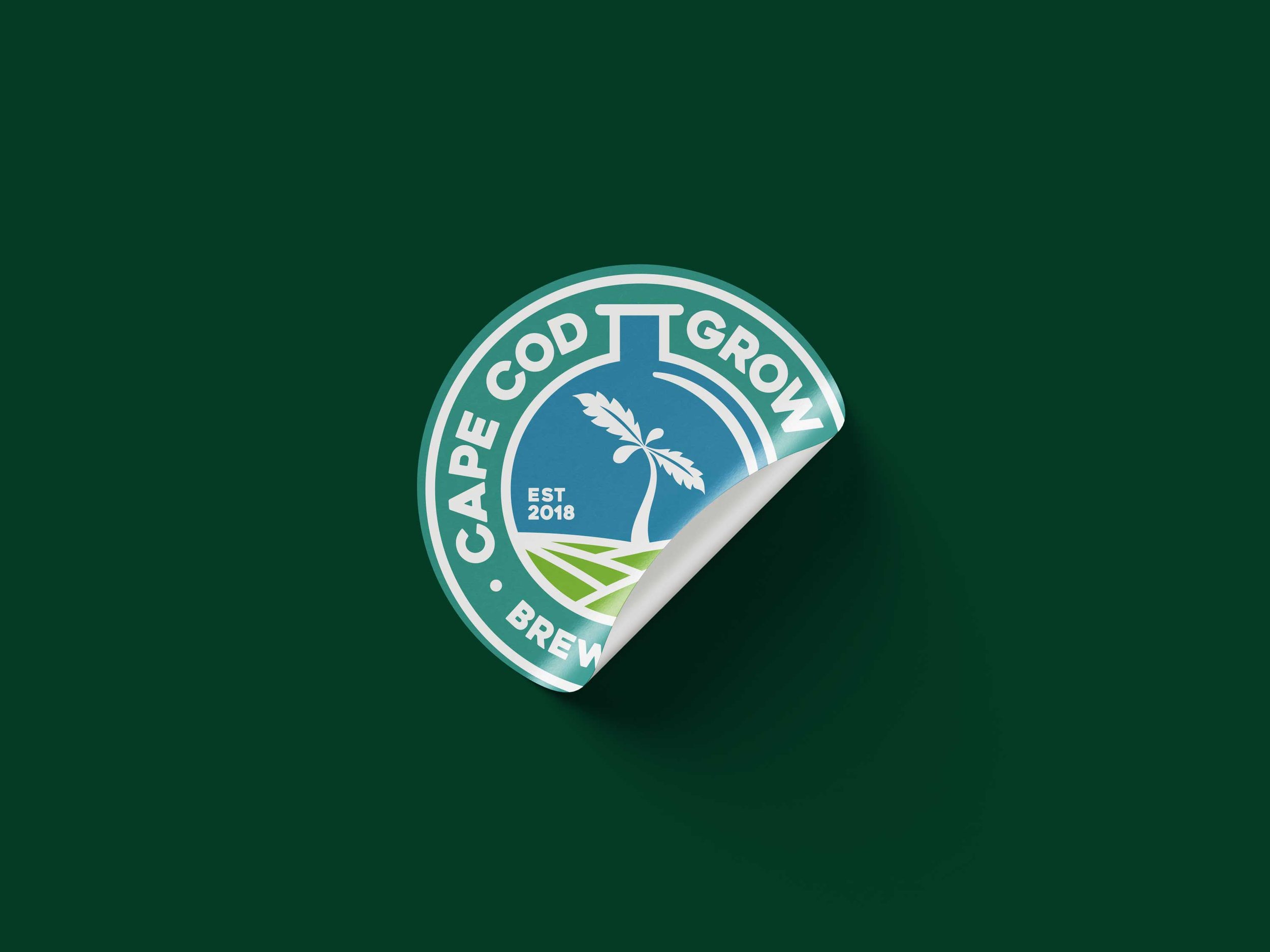
I led the brand identity refresh, refining the existing logo and developing a scalable visual system that brought together typography, color, iconography, and brand guidelines. From packaging and merchandise to digital applications and retail environments, the result was a unified brand experience that honored Cape Cod Grow Lab’s roots while positioning it for the future.

What I Delivered:
A refined, recalibrated logo system with improved balance and clarity
Extensions and variants for merch, digital, packaging, and storefront use
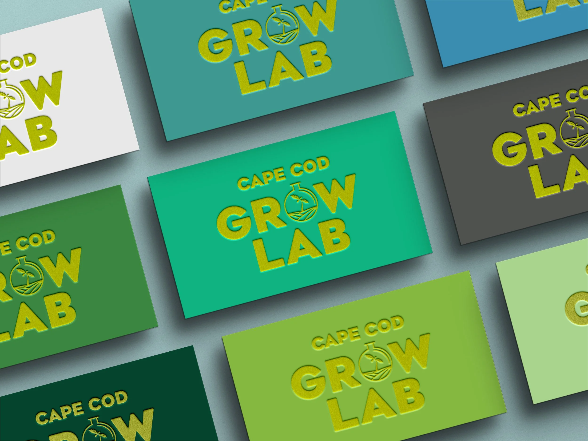
A robust color palette inspired by coastal, botanical, and scientific cues
Typography, iconography, and a fully-realized style guide
Updated brand applications across hats, apparel, packaging, and environmental design


“I had the pleasure of working with Gary Hedrick during our rebranding project for Cape Cod Grow Lab, and I couldn't be happier with the results. Gary's creative vision, professionalism, and punctuality were evident in every aspect of his work. His innovative branding concepts and clear, comprehensive guidelines not only elevated our brand but also provided us with a strong foundation for future growth. I highly recommend Gary for any project that requires a strategic and creative approach.”
Matt Griffin - Head of Cultivation, CEO, Cape Cod Grow Lab
Impact
The result is a cohesive, elevated brand with the same spirit — but stronger, clearer, and built for longevity. The visual system now supports their growth and ensures consistency across every touchpoint, from merch to marketing to retail.


