ARMSTRONG AMBULANCE
Pioneering Emergency Medicine Through Clear, Confident Design
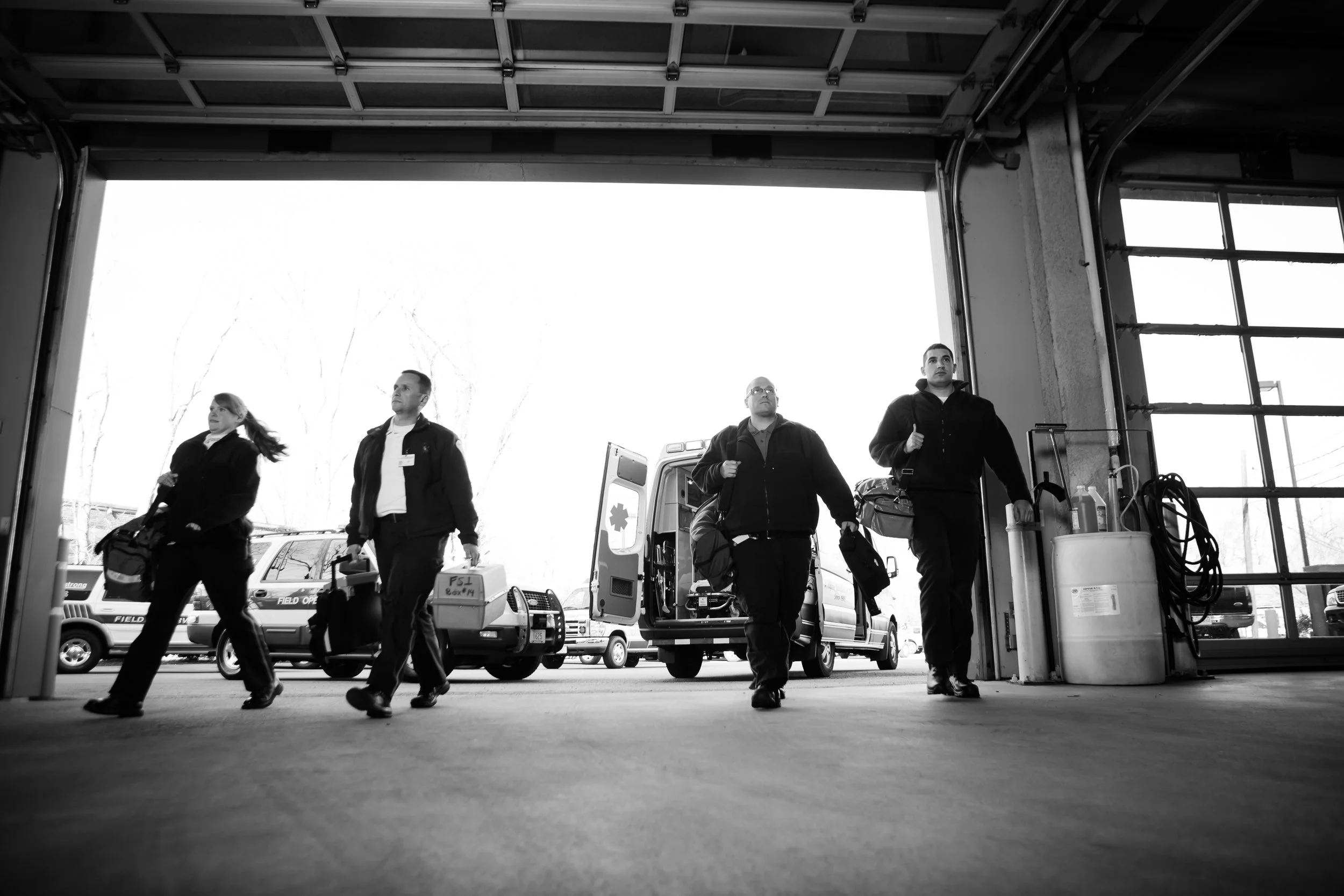
Armstrong Ambulance is one of Massachusetts’ leading mobile medicine providers, trusted by hospitals, municipalities, and communities for advanced, life-saving care. When their leadership sought to modernize the brand, they partnered with us to refresh their identity, strengthen their visual system, and create a more unified front across their organization. I delivered a contemporary brand update, a suite of new materials, and photographed their fleet, facilities, and team to bring the brand to life with authenticity and clarity.
The Challenge
Armstrong needed a brand that reflected their precision, professionalism, and legacy — but also communicated innovation, mobility, and trust. The existing identity lacked cohesion across trucks, uniforms, digital materials, and internal communication tools.
The challenge was to evolve the brand without losing the heritage and technical reliability the community already recognized.

Our Approach
I modernized the Armstrong “A” mark and heartbeat waveform into a streamlined, highly legible symbol suited for fast-moving environments, emergency vehicles, and digital use.
I built a flexible system that:
works on trucks, uniforms, ID badges, and signage
scales cleanly across print, digital, and internal materials
strengthens recognition across towns, hospitals, and facilities
aligns the brand around a clear, consistent visual language
To support the rollout, I art-directed and executed a full photographic series of their business, employees, equipment, and entire vehicle fleet. The goal was to capture the human beings behind the work — EMTs, dispatchers, paramedics, and support teams — and show the real faces of emergency medicine.
What I Delivered
Brand Identity Refresh
Updated logo mark, refined symbol, and renewed color and typography standards.
Collateral System
Business cards, stationery, badges, vehicle graphics, patches, and internal brand touchpoints.
Photography
An image library documenting the Armstrong fleet, team members, and operational environment for use in marketing, recruiting, and internal communications.
Creative Direction
Oversight of brand application, visual tone, and storytelling.

Impact
The refreshed identity strengthened Armstrong’s presence in the communities they serve and created a consistent, modern look across their operations. The updated symbol increased legibility on vehicles and social platforms, and the new photography humanized the organization — reflecting the craft, urgency, and compassion of the people who save lives every day.
Armstrong now has a brand that matches their leadership in emergency medicine: clear, capable, and built to move fast.